
Propose changes in a scenario
Once you've created a scenario, you can propose changes without affecting your primary organization in ChartHop. For example, you can add and remove jobs, move people to different managers, and plan for promotions while being able to see the structural and financial impact of your proposed changes.
The number of new jobs added and the projected annual cost of your changes are summarized at the top of the screen.
You use the following tabs when working in a scenario:
- Changes
- Impact
- Org Chart
- Data Sheet
- Map
The Org Chart, Data Sheet, and Map tabs display your organization as it would appear were the proposed changes to be enabled and put into effect.
Changes tab
As you make changes within your scenario, each change is reflected in the Changes tab. This tab displays a summary of all the changes you have made to your organization in the scenario, making it easy for you and any approvers to review everything at once.

Cost and budget impact
A scenario's total cost is shown annualized - the ongoing yearly run-rate of the changes in the scenario. Hover the cost to see how it's calculated, including any custom cost formula or multiplier your organization has configured.
When a scenario affects a budget, its budget impact bar shows how the scenario's changes move that budget's spend:
- The bar labels the cost basis the budget uses, so you know whether its numbers are annualized or measured over the budget's period.
- A marker on the bar shows the pre-scenario spend level, so you can see at a glance how much the scenario adds to (or releases from) the budget.
For the difference between Annualized and Total cost over period, see Cost basis on the Budgets page.
Impact tab
On the Impact tab, you can pull in pre-configured reports to make sure that the changes you've made to your ChartHop organization are in line with projected goals. Reports display side by side to show both the primary and scenario situations.

You can also see the impact of your scenarios directly within a specific report. While accessing a report, use the Scenarios dropdown to select a scenario and see how specifically that scenario would affect the data in the current report. Learn more.
Org Chart tab
The Org Chart tab gives you all the capabilities of the standard Org Chart, but without committing any of your changes. You can use this tab to add and remove jobs, edit roles, and generally reorganize your ChartHop organization within a visual format. Learn more.
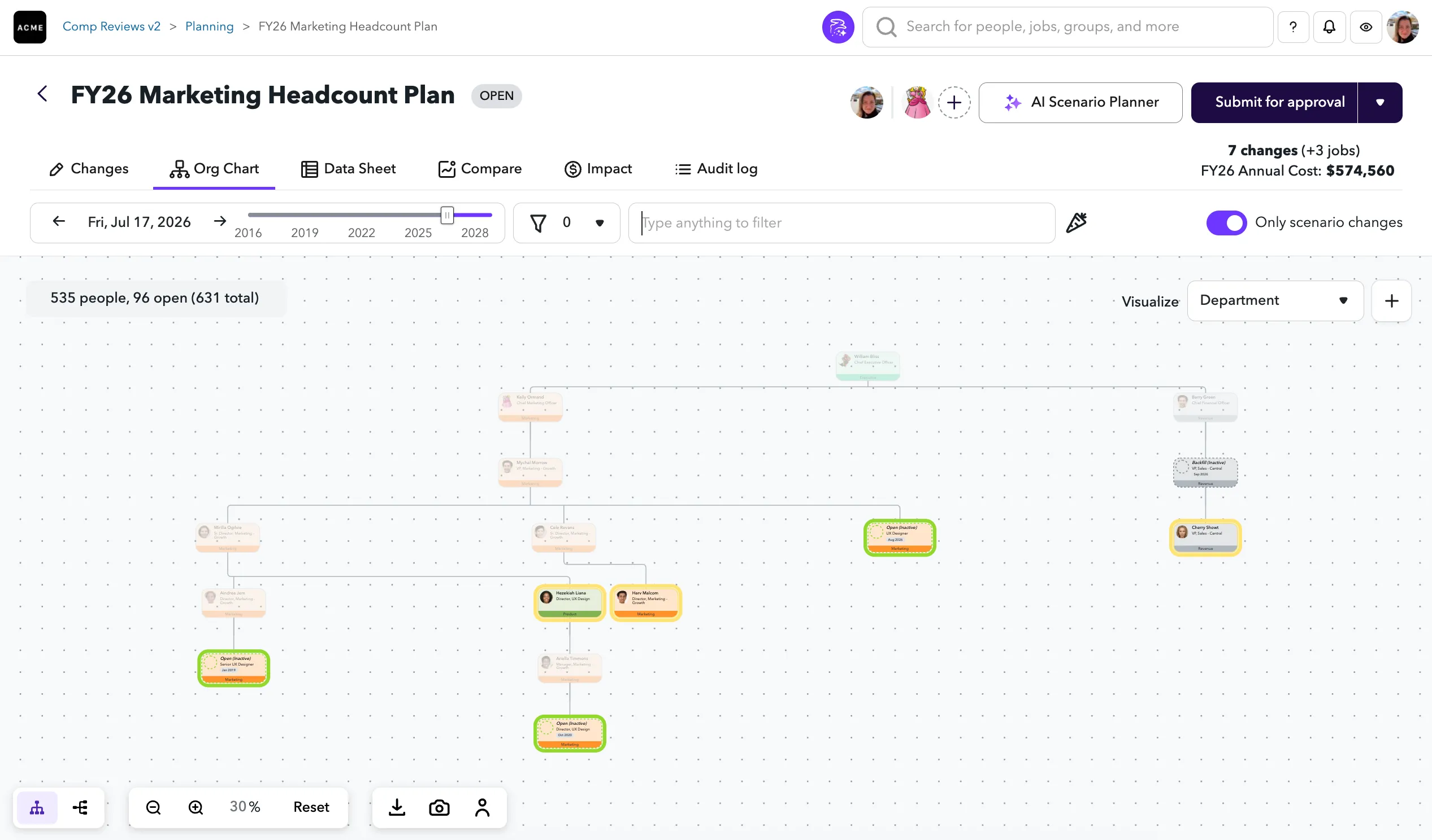
Any nodes you move or add are highlighted within the Org Chart to make those changes easier to identify. Depending on your changes, nodes can display in the following highlighted colors:
- Purple - Indicates this is the currently selected node.
- Green - Indicates this is a new job that you've created.
- Yellow - Indicates you've edited or moved this job or the person in the job.
- Red - Indicates you've terminated this job.
Only Scenario Changes
By default, the Org Chart in a scenario is filtered to show only the roles that have changes in the scenario. This helps you focus on what the scenario actually affects, rather than scanning your entire org chart.
To view the full org chart, turn off the Only Scenario Changes toggle in the filter bar above the chart. You can switch it back on at any time to narrow the view back to just the roles with changes.
Data Sheet tab
The Data Sheet tab gives you the full power of the Data Sheet, without permanently committing any of your changes. You can use this tab to filter data, create different views, and freely make changes within the instance of your scenario. Learn more.

Map tab
The Map tab lets you visualize your proposed changes over a global map. As you change data in a scenario, the map will accurately reflect your changes. Learn more.

Packages: Basic | Headcount Planning | Compensation Reviews | Performance | Engagement